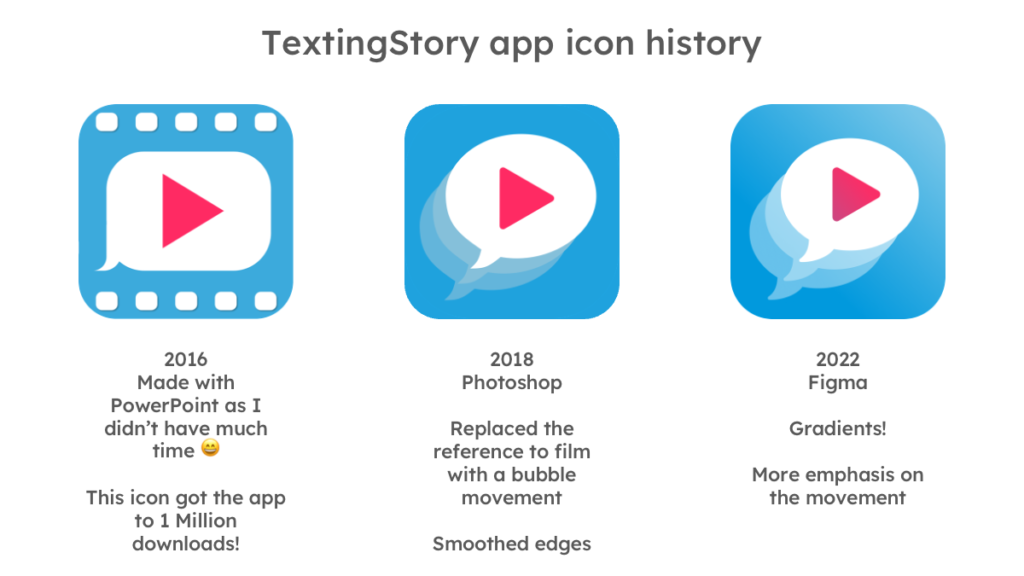
I made a slide to honor the first tool I used to make app icons 😁

When starting out, there’s so much to do that the right tool for the jobs is often the one we already know.
I tried to be as straightforward as possible to convey that the app was about videos of chat messages.
I thought the reference to analog film made the icon stand out, but I removed it when I updated the icon. It was redundant with the play sign and an app icon should contain as little information as possible. It was also pointed out to me that analog film might not resonate so much with the younger audiences that the app was attracting.
Adding a movement to the chat bubble seemed more subtle even though one could argue there’s still a lot of information on the icon. I tried to make the second icon look more professional as I was told the first one wasn’t really worthy of an app with a million downloads 😂
The third version was about getting the icon even more polished, and also about having a vector based icon because I wanted to be able to animate the icon. The next step will be to build some animations on top of it!
Before releasing the 2022 icon version I worked with a graphic designer to make a more radical design change to the icon, and we ended up with a hand-drawn lines theme to convey the writing/creativity aspect of the app.

I loved the result but in the end I didn’t use it for the app as I was scared that too big a change could hurt its marketing. It’s not entirely lost though because I’m now using it for this website instead. It’s also great for the background patterns on textingstory.com!
